Continental-Scale Climate Bias-Correction, Projection, & Interactive Dashboard
This project built a scalable pipeline to bias-correct, analyze, and visualize multi-model climate projections across the continental United States. Raw global climate model (GCM) outputs exhibit systematic biases and unrealistic spatial patterns that limit their direct use in water-resources, infrastructure, and climate-risk planning.
Using a Joint Variable Bias Correction (JVBC) algorithm, I transformed coarse, biased climate projections into high-resolution, spatially coherent temperature and precipitation fields. The resulting products feed an interactive dashboard that allows planners to explore how key climate variables evolve under different emissions scenarios, time horizons, and user-selected regions.
Background & Problem Statement
Global climate models are powerful tools for simulating future climate, but their native output is often too coarse and biased for regional decision-making. Temperature and precipitation fields can exhibit mean biases, distorted variability, and unrealistic spatial correlation structures when compared against observations.
Water and infrastructure planners require climate projections that are both physically plausible and statistically consistent across large regions so they can design robust long-lived assets (reservoirs, conveyance systems, treatment plants, etc.). Ad hoc bias-correction at a few stations is not sufficient for continental-scale assessments.
Problem Statement: How can we convert raw multi-model climate projections into spatially coherent, bias-corrected datasets and a user-friendly dashboard that supports continental-scale climate risk and water-resources planning?
Bias-Correction & Modeling Framework
I designed a modular processing pipeline that ingests historical observations and GCM simulations, applies JVBC-based bias correction, and derives climate indicators suitable for planning and communication.
-
Data Assembly: Collected multi-model historical and future climate
projections
(temperature and precipitation) along with gridded observational or reanalysis datasets
used as the “truth” reference. All data were harmonized on a common grid and calendar using
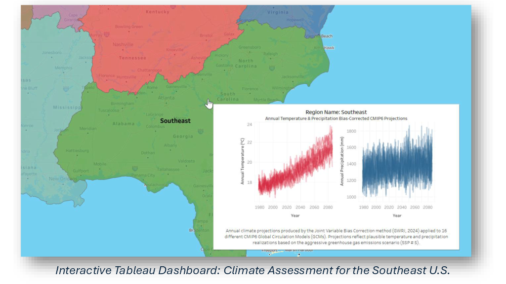
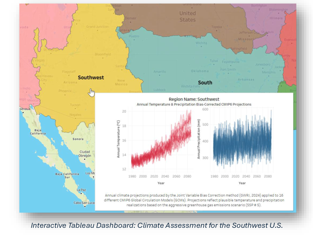
xarrayanddask-friendly workflows. - Joint Variable Bias Correction (JVBC): Implemented a JVBC algorithm that simultaneously corrects temperature and precipitation, preserving their joint distribution and spatial correlation structure while removing model-specific biases in means, variance, and extremes.
- Temporal & Spatial Scaling: Downscaled coarse GCM fields (~100 km) to ~10 km grid cells and to daily-to-monthly time steps, enabling both local and regional statistics to be computed consistently across CONUS.
- Derived Climate Metrics: Computed seasonal and annual precipitation, mean temperature, hot and cold extremes, and drought-relevant metrics (e.g., precipitation minus potential evapotranspiration).
- Validation & Skill Assessment: Evaluated bias-corrected fields against withheld observations and reanalysis, showing substantial improvement in accuracy and spatial coherence—reducing key error metrics by more than 50% relative to raw model output.
Deployment & Interactive Dashboard
Once the core bias-correction and metric-generation pipeline was stable, I focused on packaging the outputs and building an interactive experience that domain experts could explore without touching code.
- Pre-Computed Data Products: Exported bias-corrected climate fields and derived indicators as NetCDF and Parquet assets, organized by model, scenario, time horizon, and variable for efficient retrieval.
- API / Data Access Layer: Implemented lightweight access utilities in Python to query time-series or spatial slices for arbitrary locations, watersheds, or administrative regions.
-
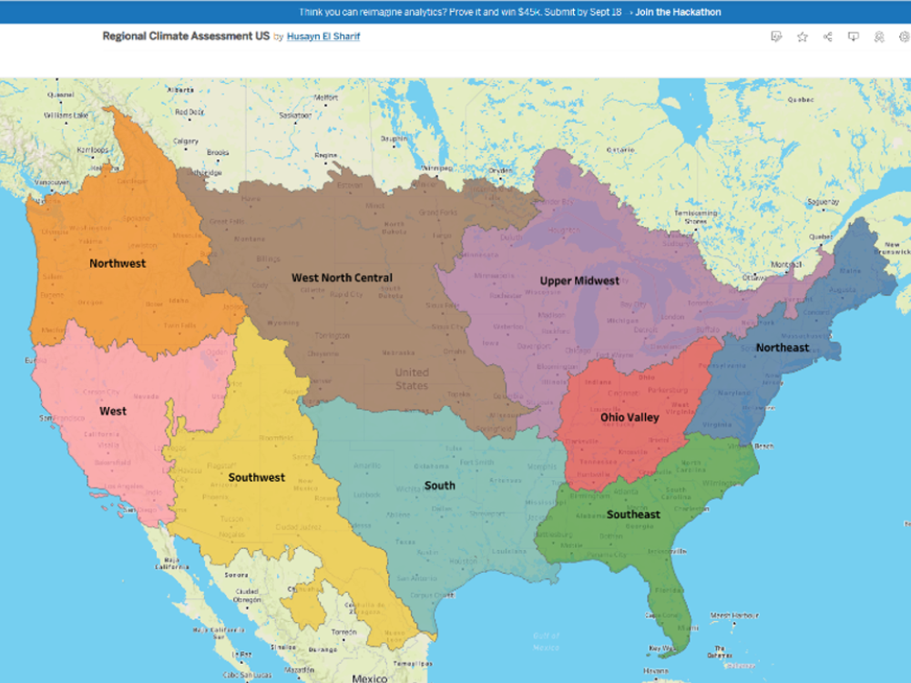
Interactive Dashboard: Built a web-based dashboard (Plotly Dash /
Streamlit)
that allows users to:
- Select emissions scenarios and time slices (e.g., 2030s, 2050s, 2080s).
- Visualize maps of temperature, precipitation, and drought metrics across CONUS.
- Extract and plot time-series for specific locations or user-defined regions of interest.
- Compare raw vs. bias-corrected fields to understand the impact of the correction method.
- Performance & Portability: Optimized data loading and caching so the dashboard remains responsive, and containerized the application for deployment on institutional servers or cloud environments.
Impact & Actionable Insights
The bias-corrected projections and dashboard transform dense climate-model output into a decision-support tool that non-modelers can interrogate directly.
- Improved Reliability: The JVBC framework significantly improves the realism of climate projections, especially for regional precipitation patterns and variability—key drivers of drought and flood risk.
- Scalable to Many Users: Because all heavy computation is performed up front, planners, engineers, and analysts can run “what-if” scenario explorations in the dashboard without waiting on long-running model jobs.
- Supports Long-Term Planning: Utilities and agencies can use the tool to stress test infrastructure and water-management strategies under multiple climate futures, improving the robustness of long-lived investments.
- Reusable Architecture: The same bias-correction and dashboard architecture can be adapted to other regions or sectors (e.g., hydropower, urban heat, wildfire risk), accelerating future climate-analytics projects.